I undertook a disability design project at CSM, exploring how the university’s wayfinding system could better support blind and visually impaired people. My project was informed and assessed by industry professionals in disability design who were invited to CSM, providing valuable insight into real-world accessibility considerations. My approach combined user research, accessibility testing, interaction with physical spaces, and rapid prototyping to explore and develop potential improvements to the existing wayfinding system.
Role Timeline
Product Designer 2025
Scope
User Research · Accessibility · Wayfinding · Product Design · User Testing · CAD · Prototyping · Iteration · 3D Printing
Challenge
The project originated from my own difficulties navigating the studio space as a sighted person. I became aware of how heavily I relied on visual information to navigate, despite signage and environmental cues not always being clear or legible, and recognised that these challenges could be significantly greater for someone who is blind or visually impaired. A key challenge was ensuring the project was grounded in meaningful research into the experiences and needs of the blind and visually impaired community, while remaining mindful that I was designing from outside of that lived experience. I also needed to carefully define the scope of the project so that research, testing, and prototyping could be completed within a three-week timeframe.
Solution
I researched existing accessibility and wayfinding systems and reached out to relevant blind communities to better understand the experiences and needs of potential users. I also conducted user testing within the space I was designing for, using direct feedback to identify practical requirements and inform the development of my system. The key outcome was the redesign of tactile flooring to suit an indoor environment, adapting an established accessibility feature to the specific context of the university. To complete the project within the three-week timeframe, I narrowed the scope from the wider visually impaired community to focus specifically on blind users, while combining 3D printing with hand-crafted prototyping to test ideas quickly and efficiently.
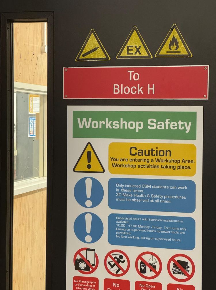
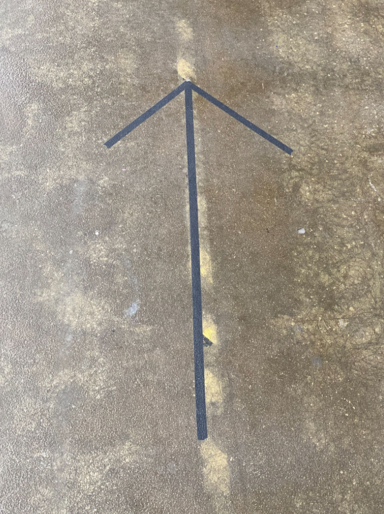
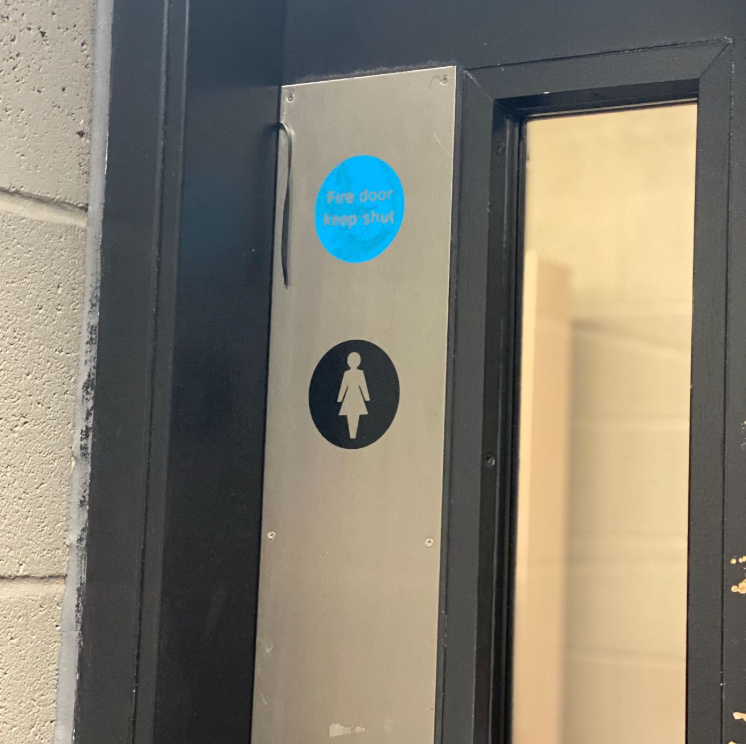
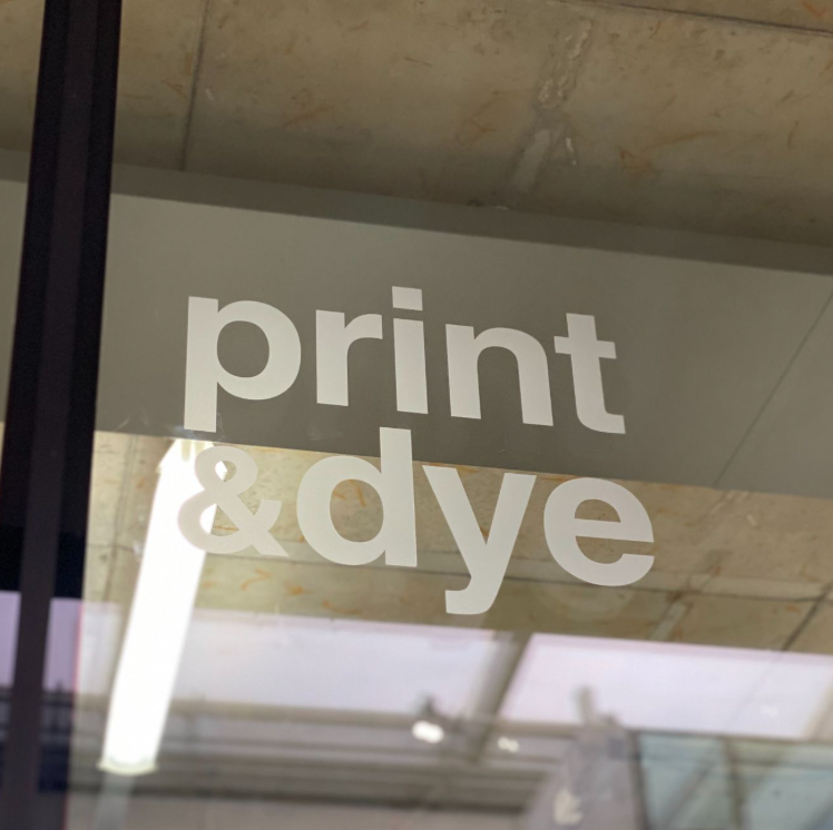
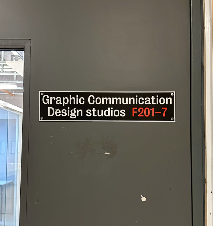
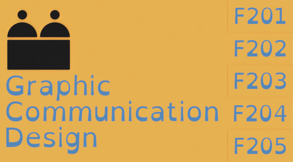
I documented and analysed the existing signage at CSM, identifying several accessibility issues within the current wayfinding system. Much of the signage relied on translucent text and red–green colour combinations, creating potential barriers for people with colour vision deficiencies, while many navigational cues appeared to have been added as an afterthought rather than being integrated into the overall spatial design. This made it difficult to establish clear routes through the building and could leave users uncertain about where to go.
Given the three-week timeframe, from initial research through to presenting the project to industry professionals, I narrowed the scope to focus specifically on the signage and wayfinding system within the Graphic Communication Design (GCD) studio space. This allowed me to investigate the issues in greater depth and develop a more focused, achievable design response.
GCD Signage Problem
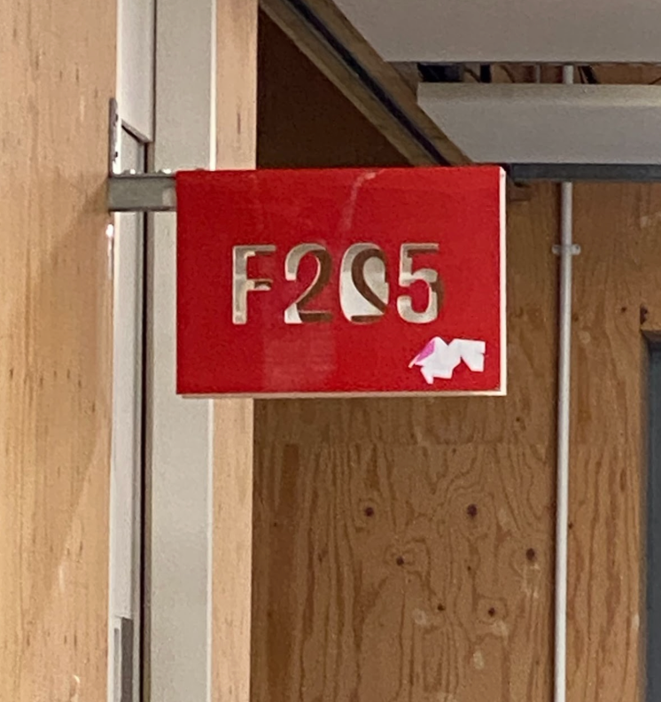
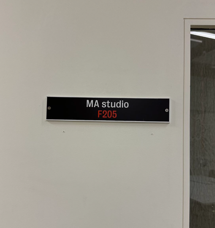
I identified several accessibility issues within the existing signage in the GCD studio:
• The hollow signboards contained overlapping elements and reversed text, which could make information difficult to recognise and interpret.
• The type was relatively small, while some colour combinations created insufficient contrast between the text and background.
• The signs relied entirely on written information, with no supporting symbols or visual cues to aid recognition.
Research
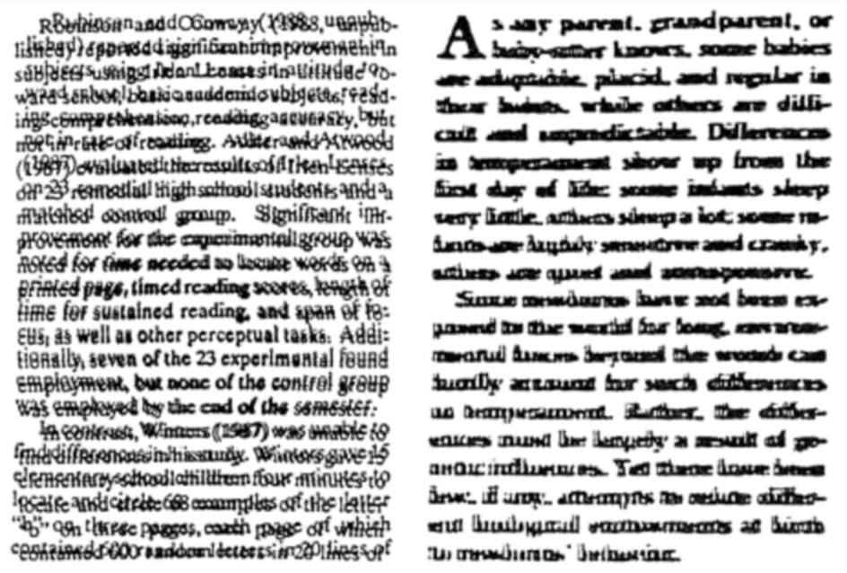
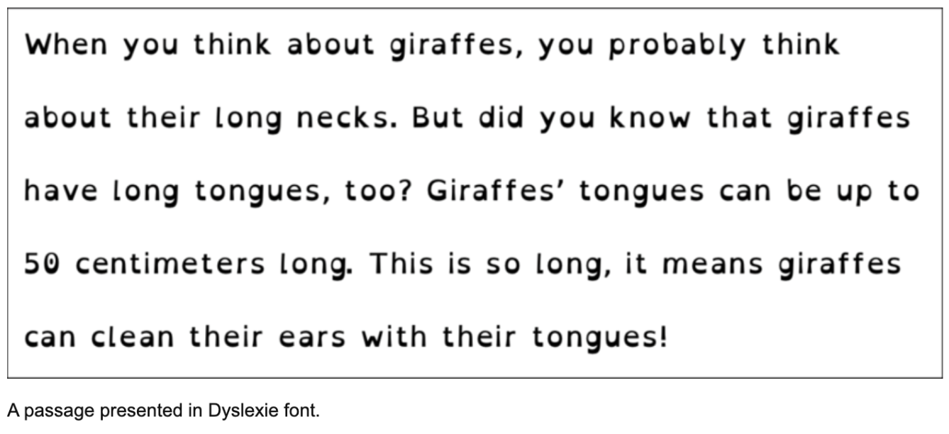
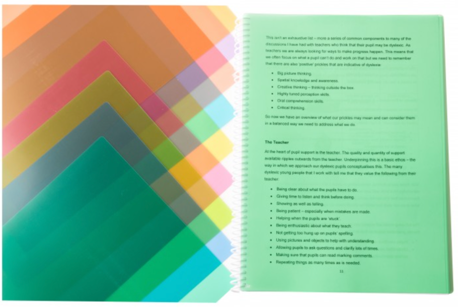
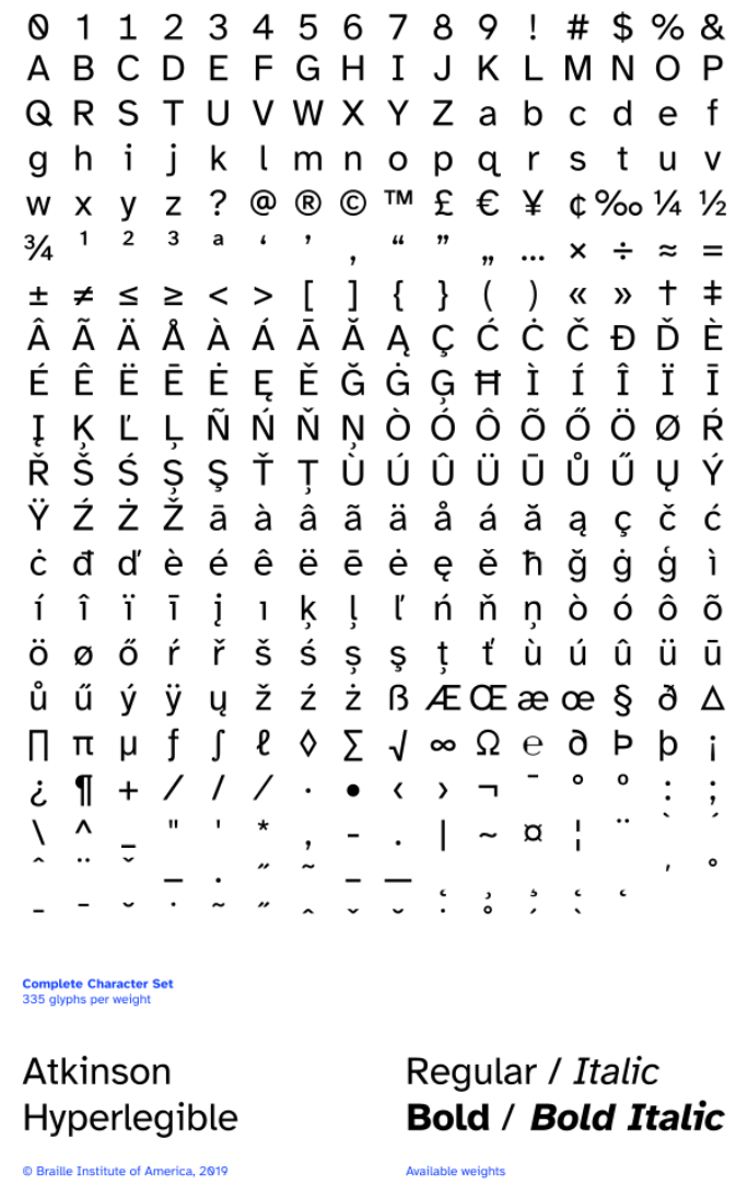
I researched three areas of visual accessibility: low vision, dyslexia, and colour blindness, focusing on how typography could improve readability and reduce visual confusion. Key considerations included using sans-serif typefaces with a large x-height, distinct letterforms, and avoiding italic or condensed styles, which can be harder to read. I explored accessible typefaces such as Atkinson Hyperlegible, which uses distinctive letterforms and strong contrast to improve character recognition, and FS Me, which features open counters and increased letter spacing to support readability. I also investigated typefaces specifically designed for people with dyslexia, considering how letter spacing, weight, and character differentiation can support easier reading.
User Testing
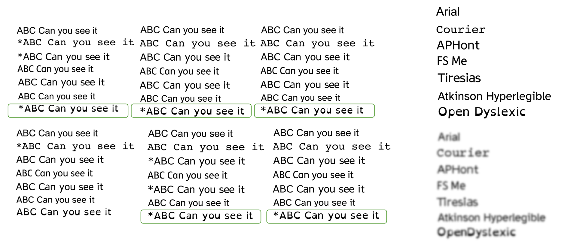
I wanted to identify the most suitable typeface for both dyslexic readers and people with low vision, so I conducted a user test with 20 participants in the studio, including people with dyslexia, visual impairments, and typical vision. Participants were asked to read samples set in different typefaces and select those they found clearest and easiest to read. The results indicated that OpenDyslexic was perceived as the most legible option across the participant group.
Font Design
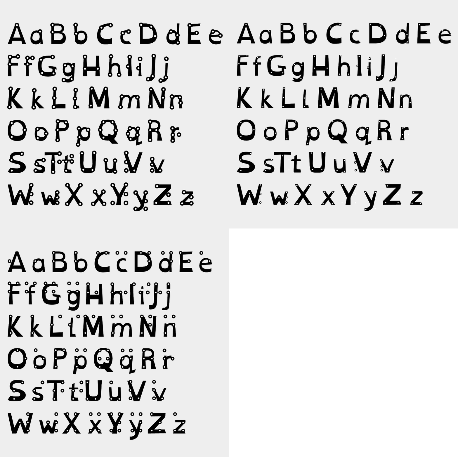
I developed a variant of OpenDyslexic that incorporated Braille, exploring three approaches to balance accessibility with readability. The first fully integrated Braille into the letterforms, but giving it too much visual prominence reduced legibility and created a barrier for the target audience. I then reduced the size and visual emphasis of the Braille elements, which significantly improved readability. Finally, I explored combining standard Braille with the glyph forms, but chose not to fully overlap the two due to the requirements of the final presentation format.
Colour Blindness
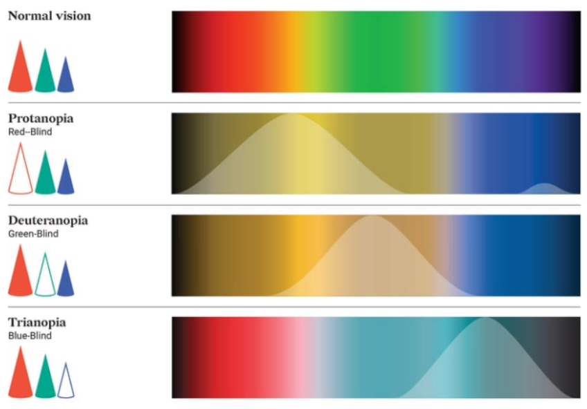
There are three common types of colour blindness: protanopia (red-blind), deuteranopia (green-blind) and tritanopia (blue-blind).
Colour vision deficiency can also occur as colour weakness, where colours remain distinguishable, but some differences in hue are reduced, while the rare condition of complete achromatopsia results in little to no colour perception.
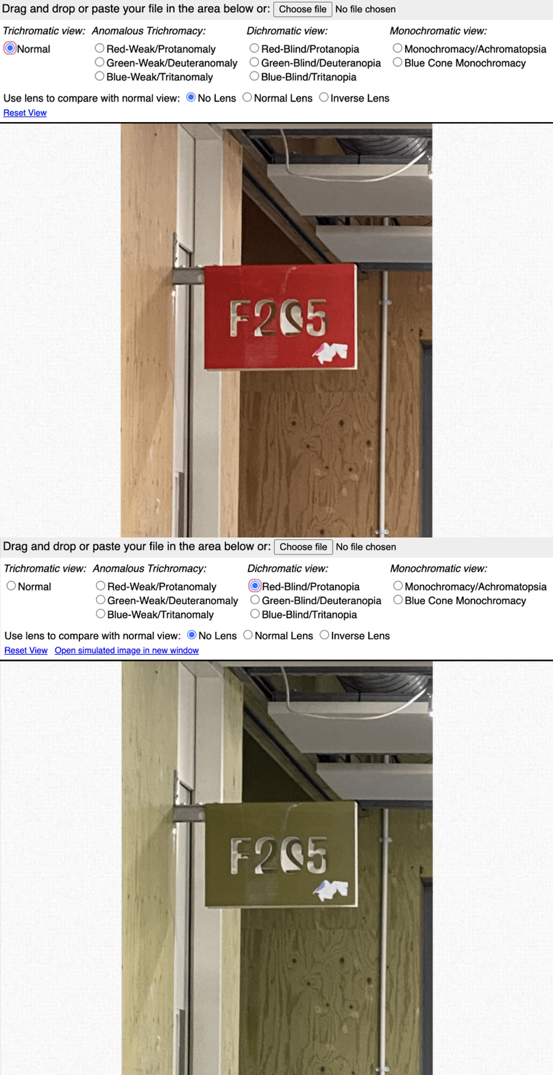
The right image demonstrates how colours may appear under different forms of colour blindness, also demonstrating how the red used in the studio’s existing signage can become difficult to distinguish, potentially creating a barrier to navigation.
Tactile Design
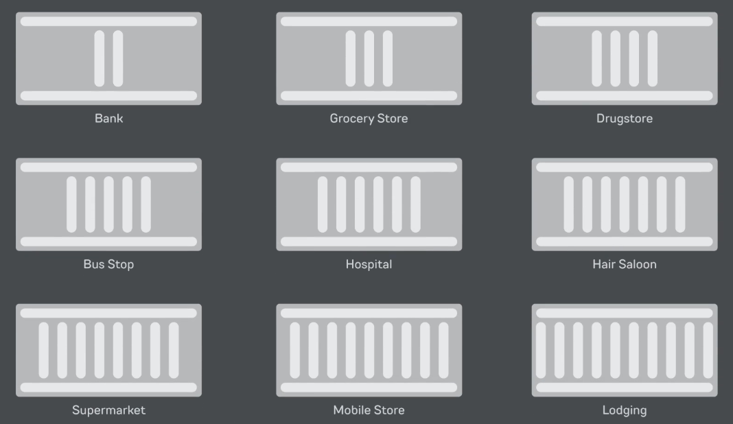
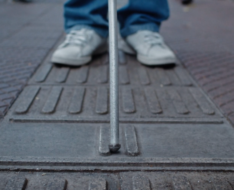
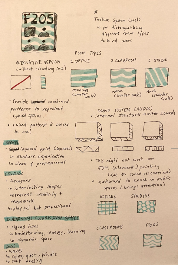
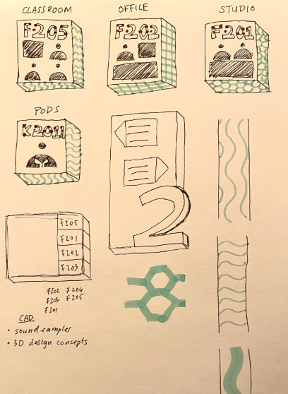
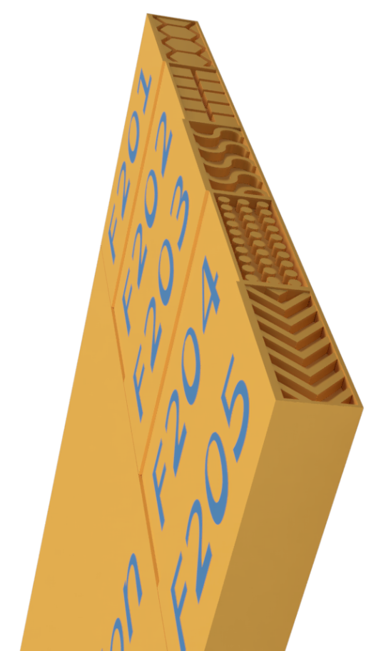
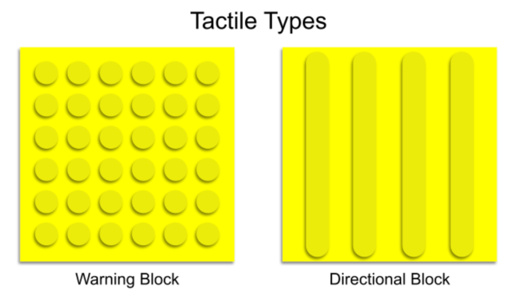
I researched tactile design, particularly the use of specialised floor tiles in public spaces such as shops, banks, pharmacies, and restaurants to help blind people identify different types of businesses and institutions. As these tactile systems are already familiar to many blind users, this research informed my decision to incorporate tactile elements into the signage, developing a new tactile code to support navigation and recognition within the space.
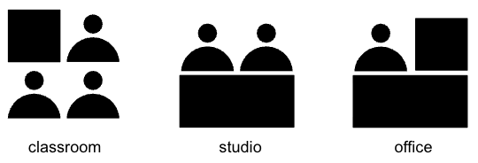
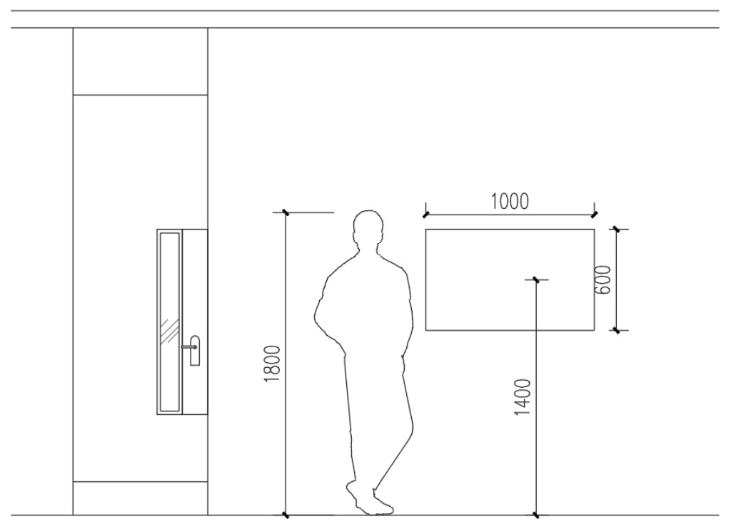
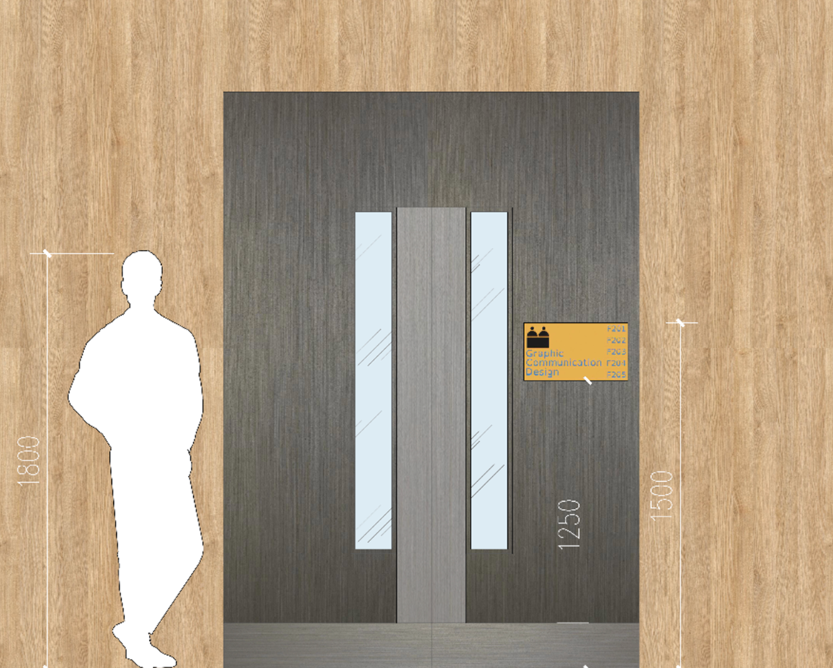
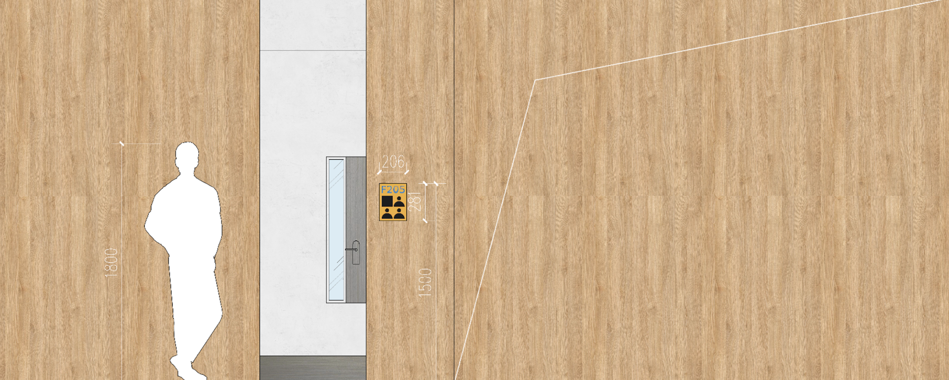
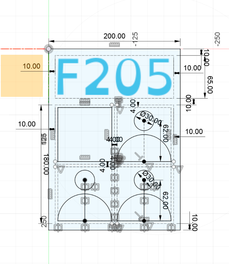
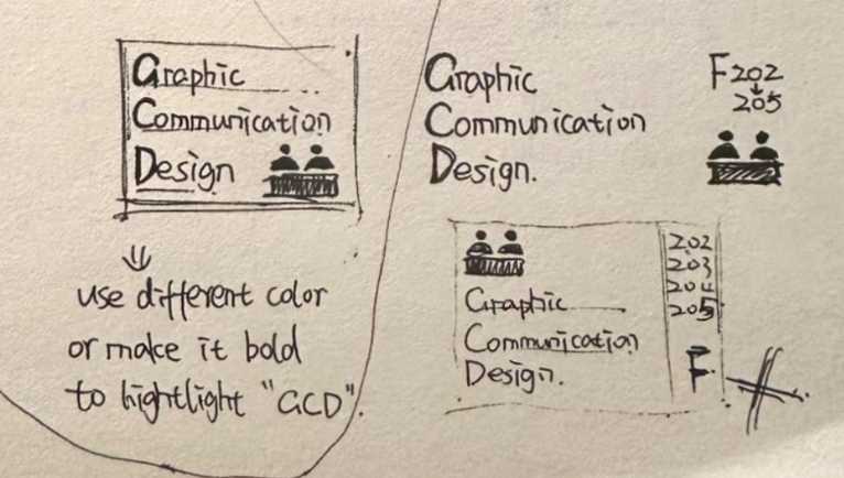
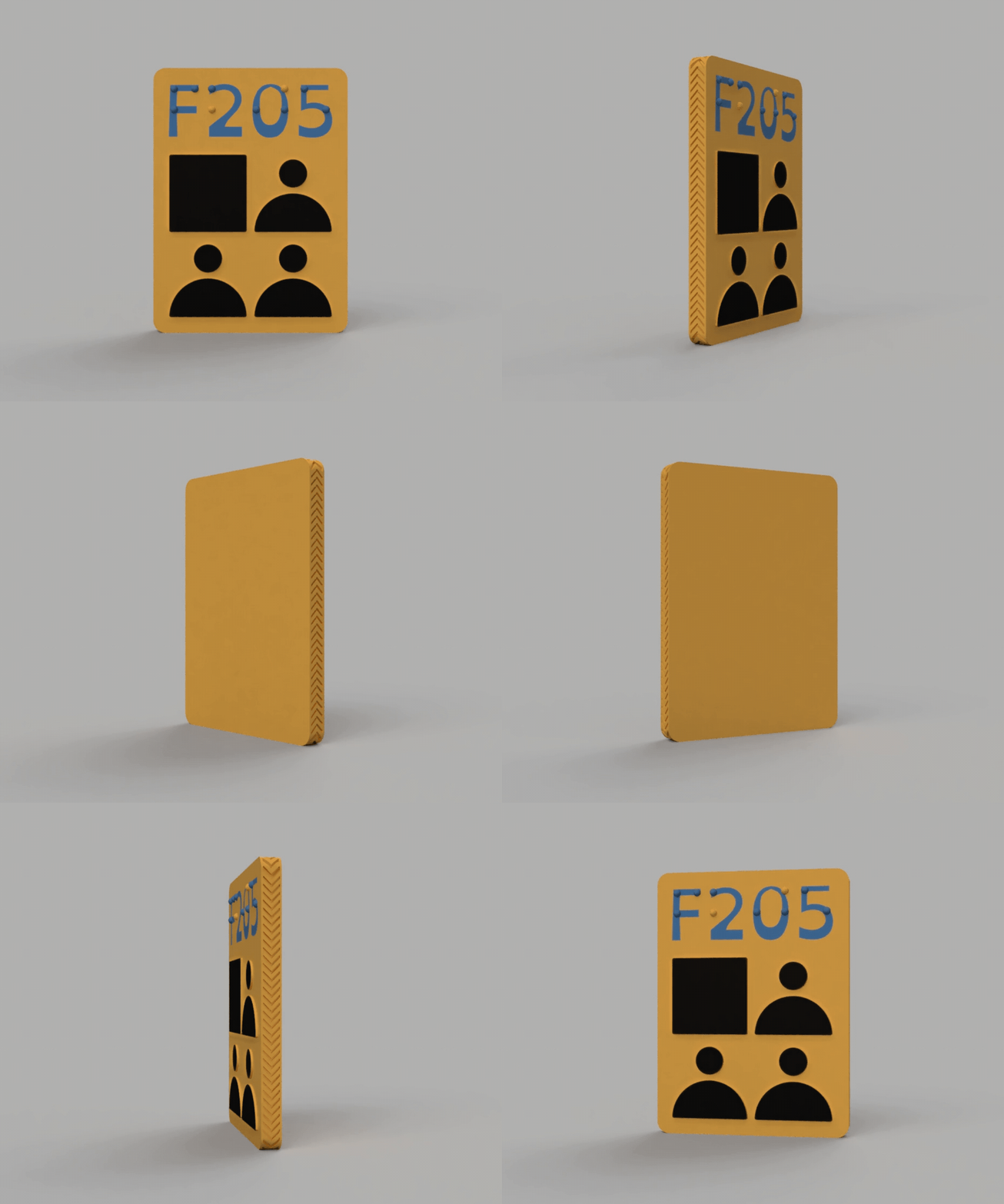
I applied key findings from my research throughout the design process, selecting colours that were accessible for both dyslexic and colour-blind users and developing simple, minimal icons to support quick recognition for people with low vision. I also created environmental mock-ups to test the signage in context, considering factors such as sign size, placement, and height to ensure information could be both easily seen and physically accessed through touch.



Outcomes
The final concept proposed a more accessible physical wayfinding system for the university environment, developed through research, prototyping, and user feedback. It demonstrated how accessibility considerations can shape both the information architecture and physical design of a wayfinding system. However, feedback from industry professionals following the presentation of the first version highlighted several limitations. Most notably, the project scope was too broad, and I needed to focus on a single disability group to develop a more considered and effective end-to-end solution.
Research Prototype 2
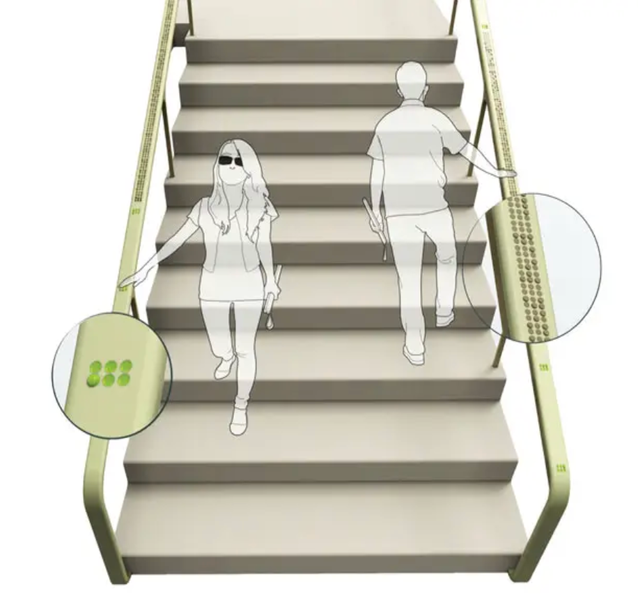
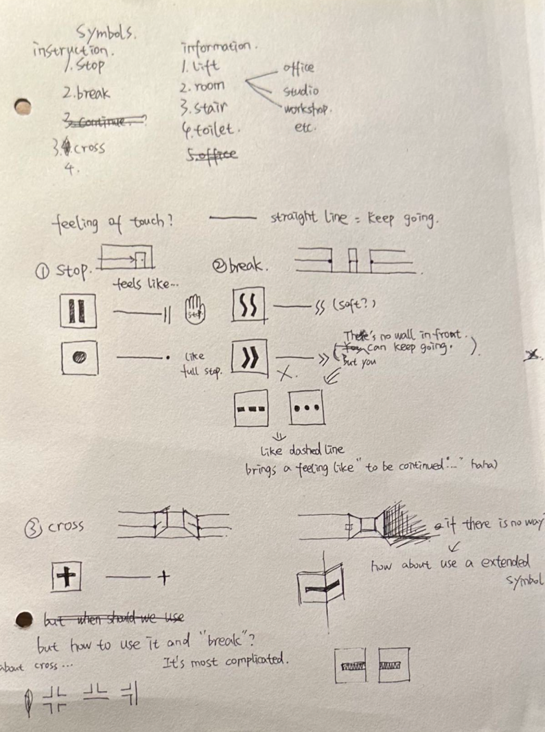
I narrowed the scope of the project to focus specifically on blind users, allowing me to develop a more focused end-to-end solution. I researched existing tactile paving systems and projects that integrate tactile and Braille information into common features such as staircase handrails, providing navigational information without disrupting the experience of other users. These systems demonstrated how Braille could communicate information such as floor levels and the number of remaining stairs, leading me to reconsider my initial approach of creating a new tactile code; instead, I chose to use established tactile conventions that blind users are already familiar with, making the system more intuitive and reducing the need to learn a new visual or tactile language.
CAD Design and 3D Printing
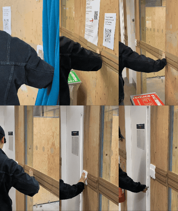
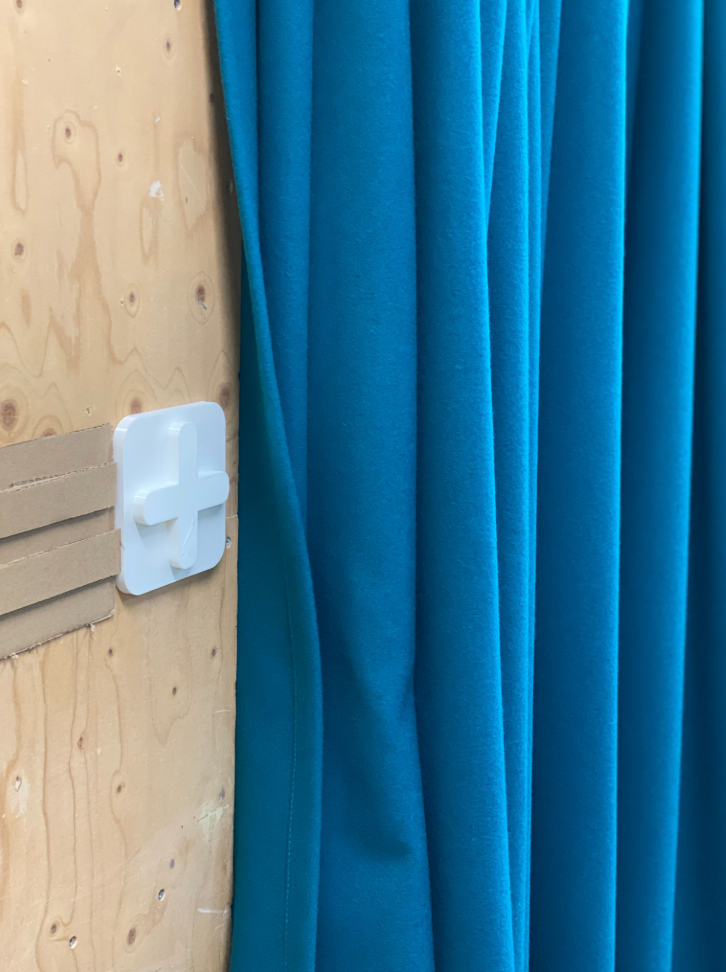
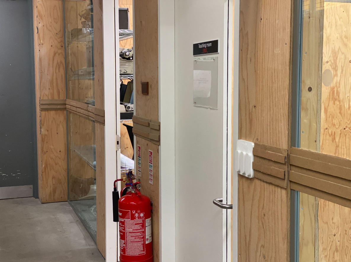
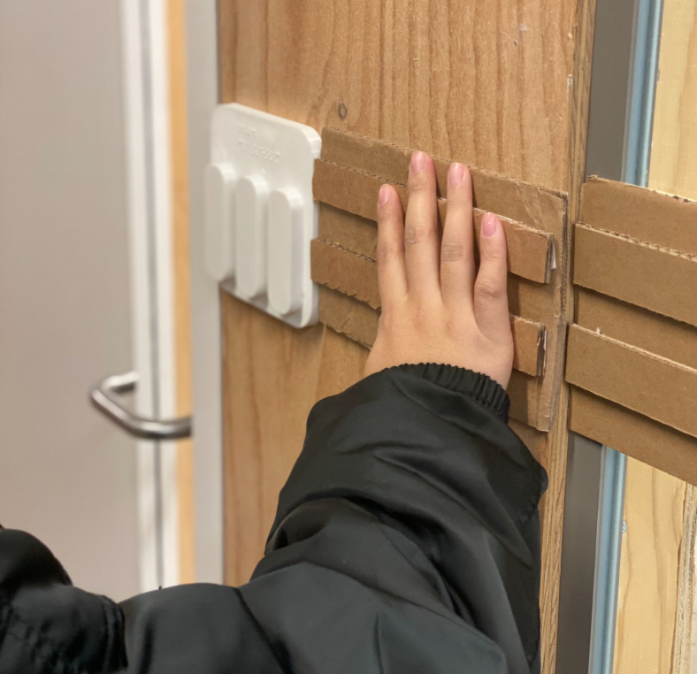
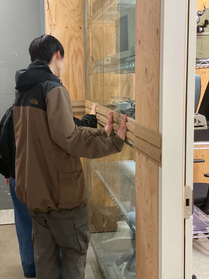
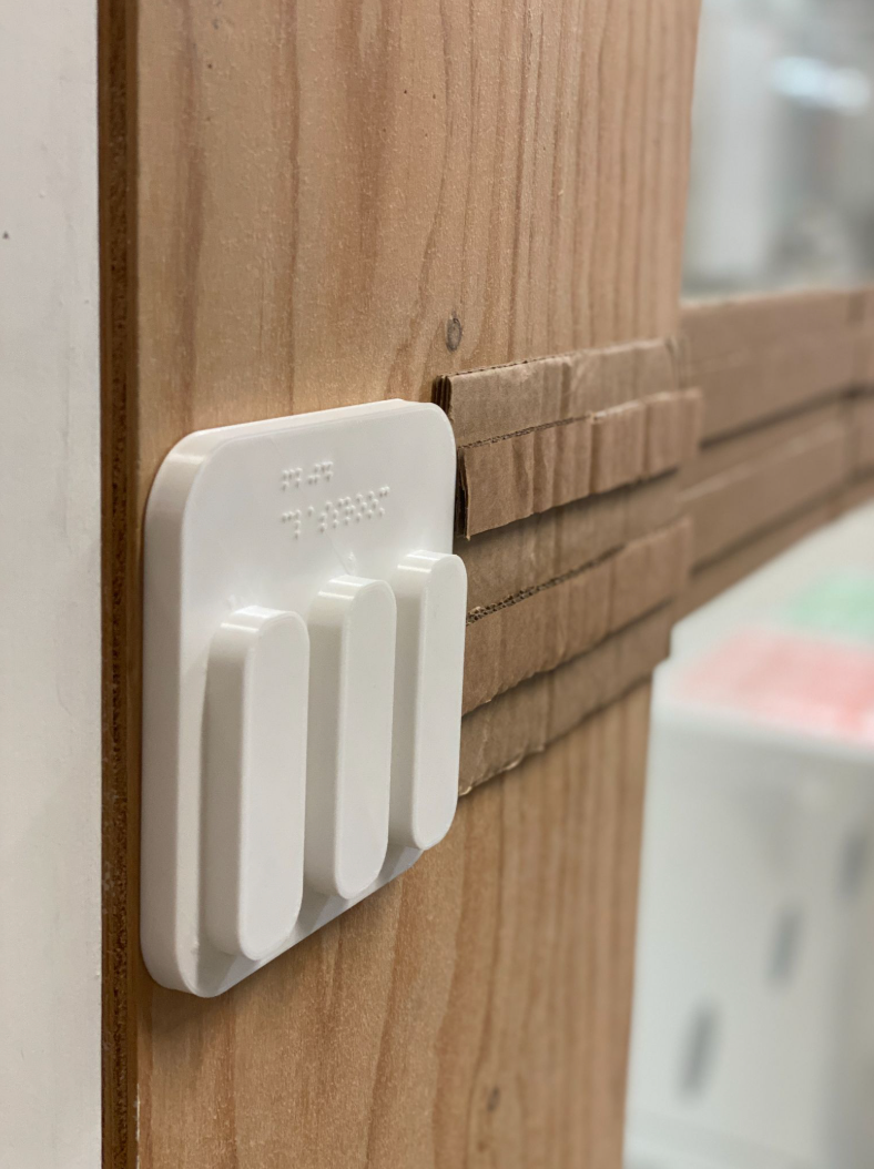
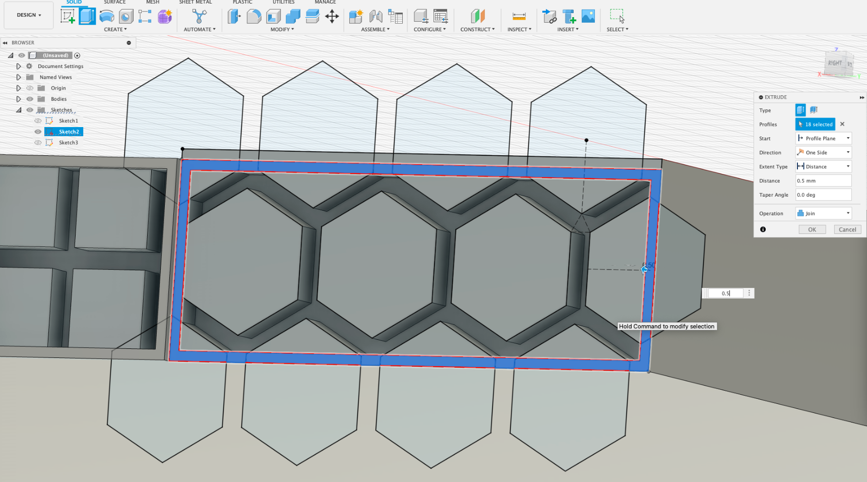
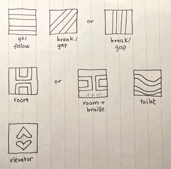
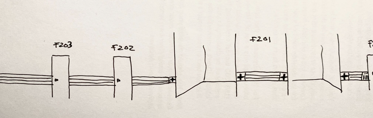
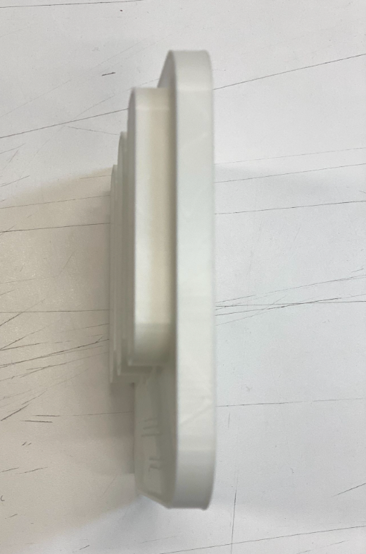
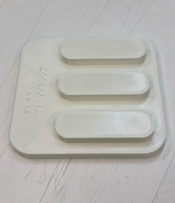
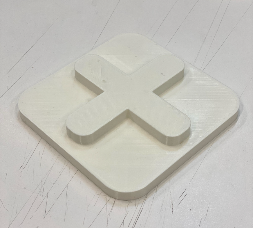
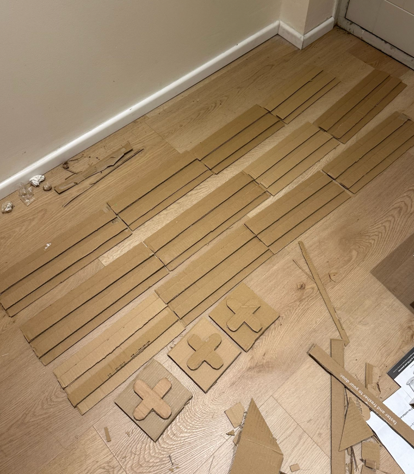
I designed three signs for the wayfinding system, each based on established tactile conventions. The first sign indicated a ‘stop’ point, with room information presented in Braille on the upper surface of the block, directly referencing the tactile paving convention for stopping. The second identified the elevator, which was particularly important as the building contained several lifts, with the one serving the studio located in a less visible corner. The third sign indicated a ‘jump’ or pause in the tactile path, addressing the challenge of using tactile paving indoors, where it can disrupt pedestrian traffic. Instead, I explored using walls as continuous tactile pathways that users could follow. However, the studio’s flexible layout included open sections without walls to accommodate exhibitions and other activities, so I introduced a sign indicating that users should continue walking forward until they reached the next wall.
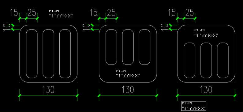
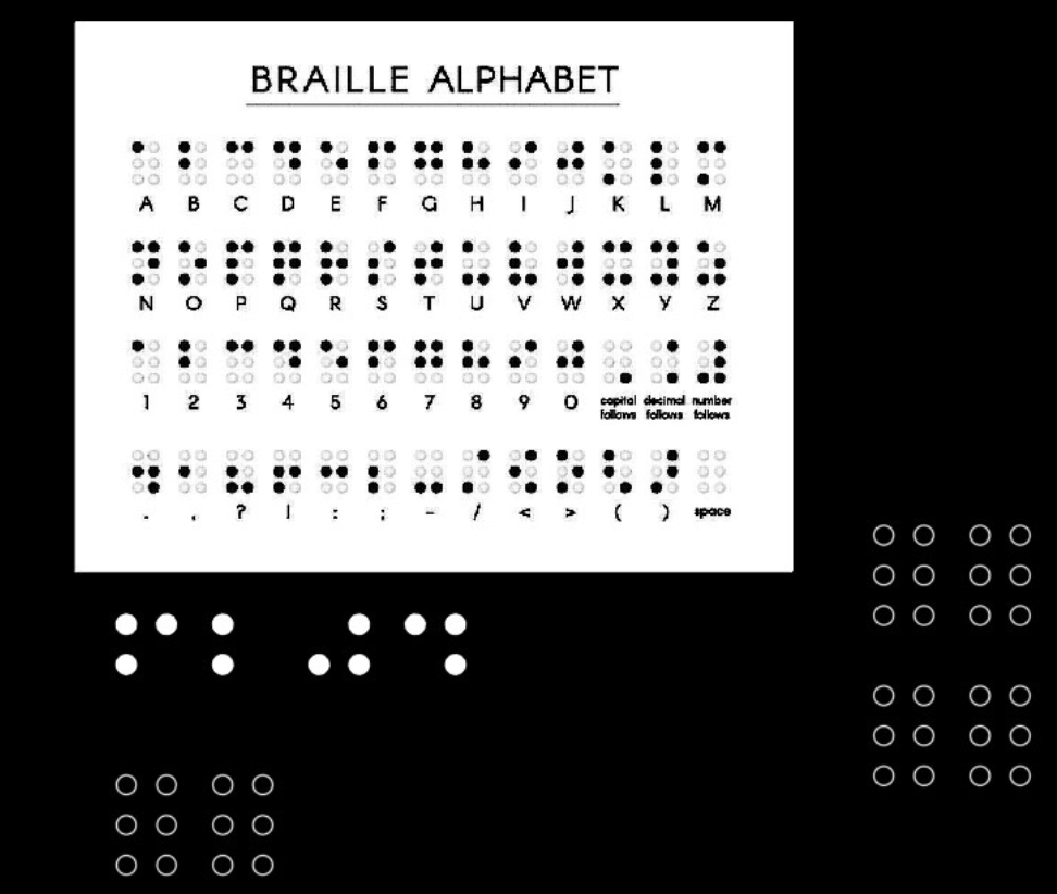
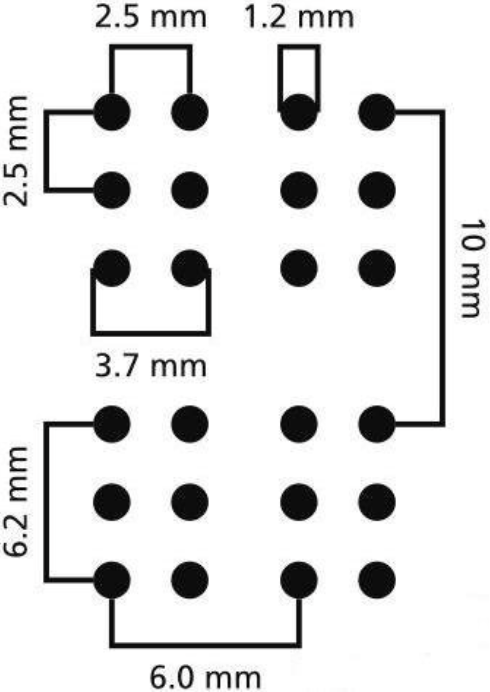
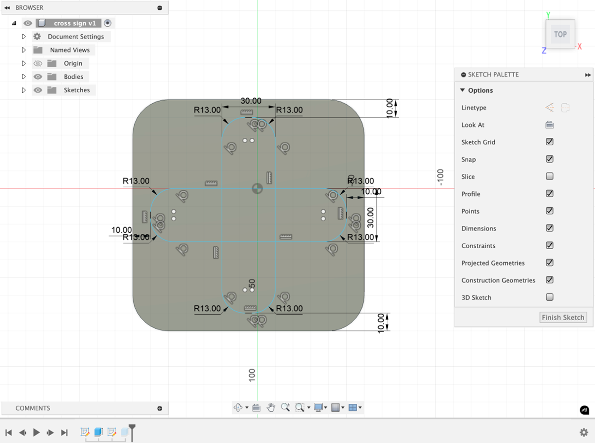
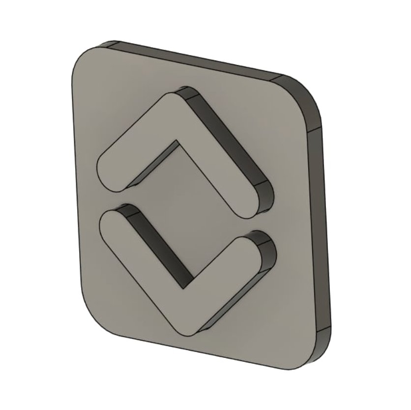
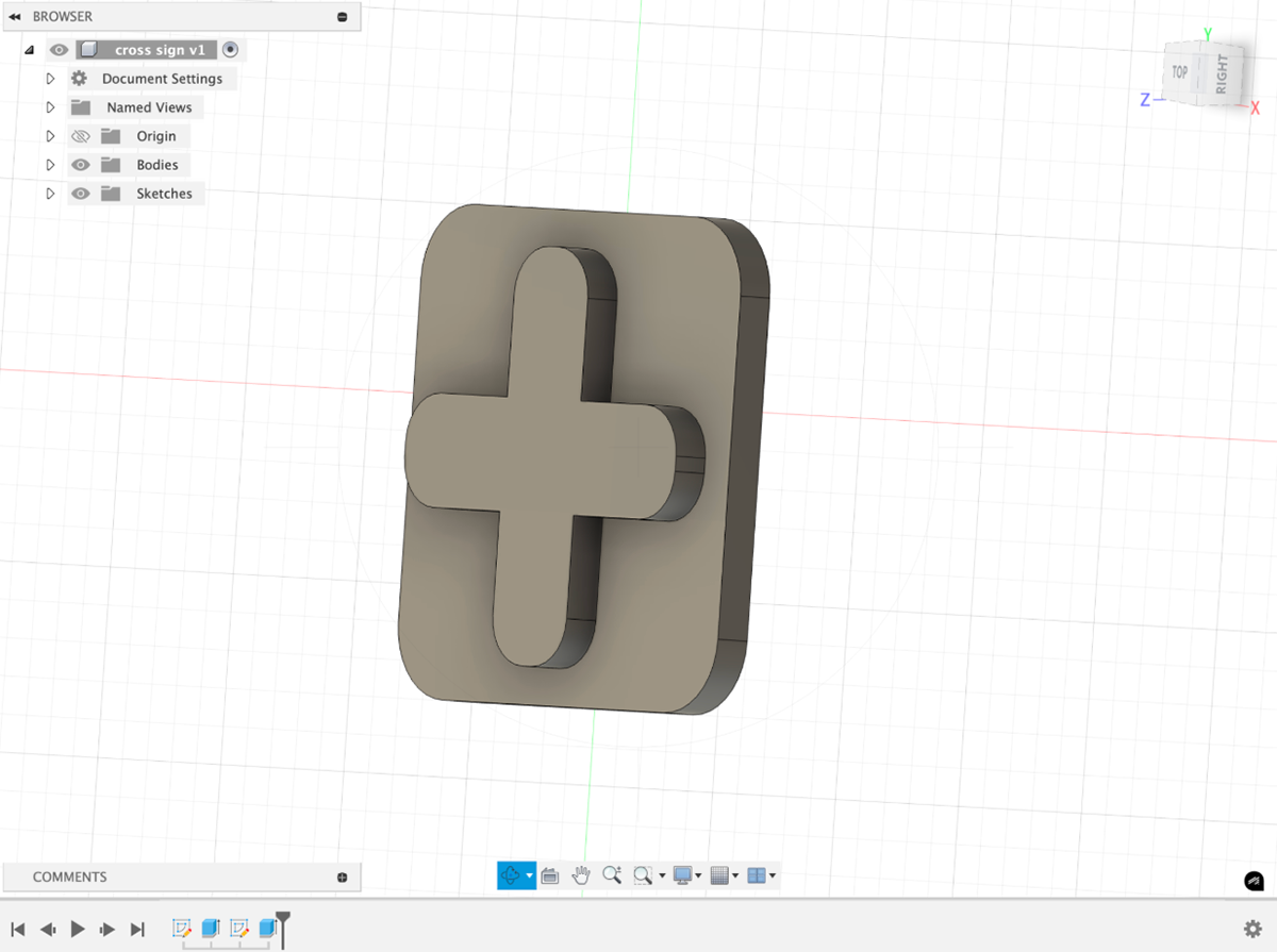
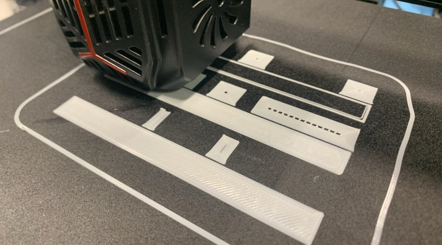
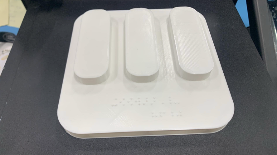
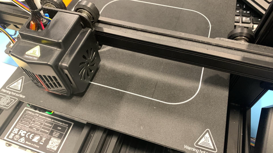
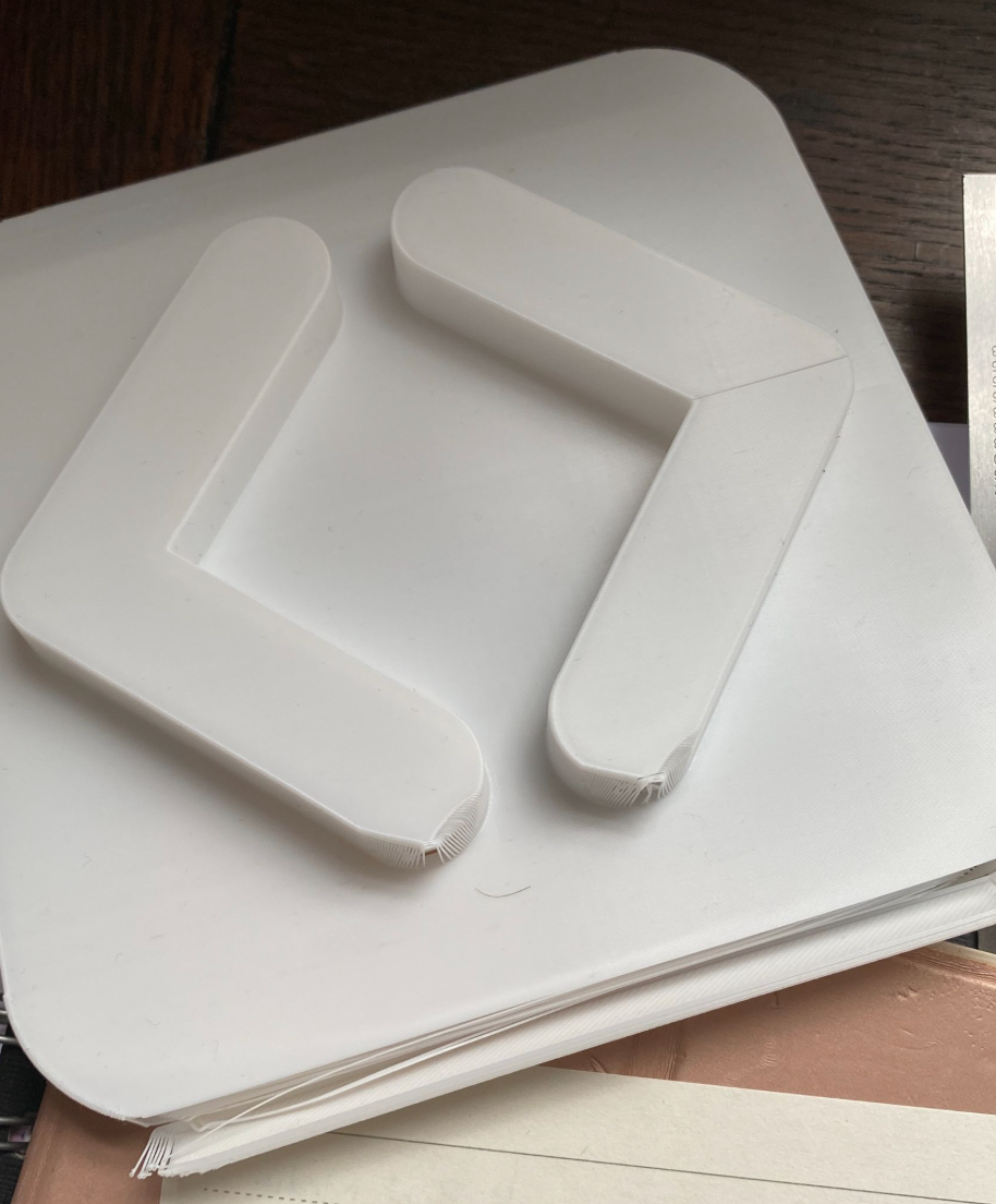
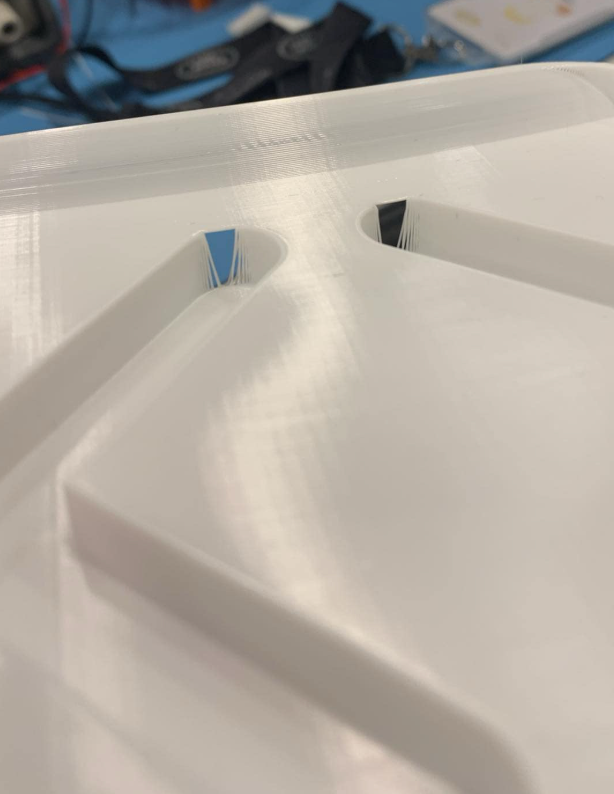
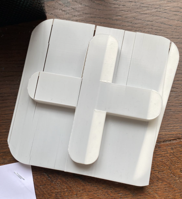
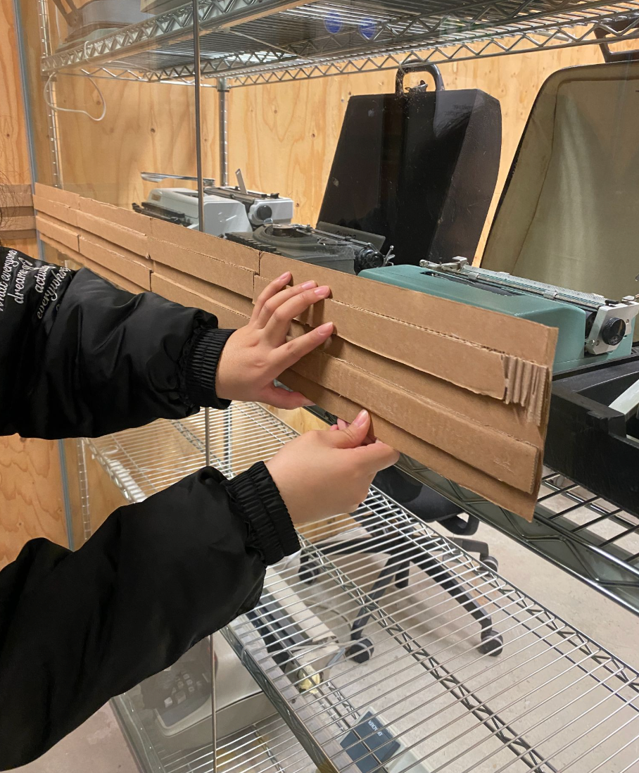
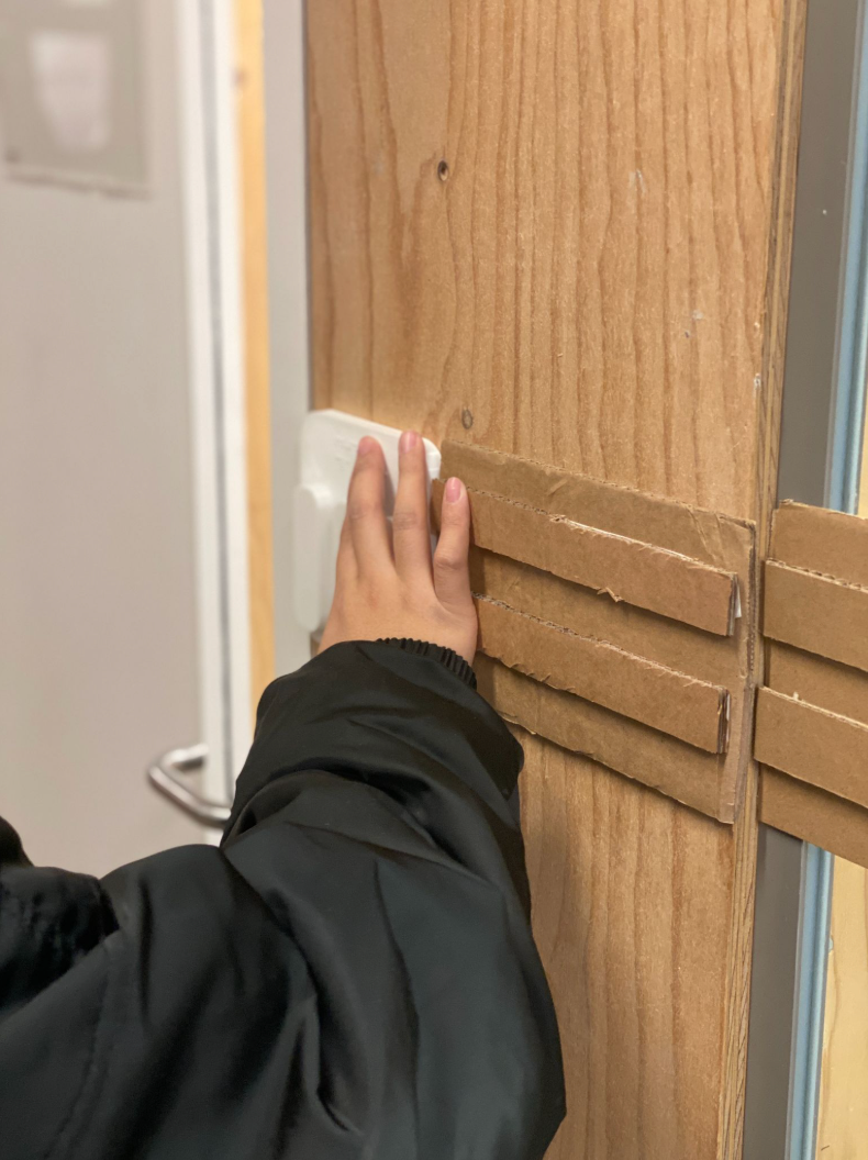
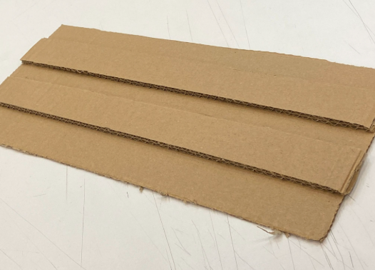
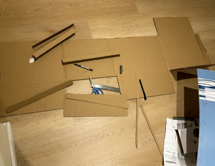
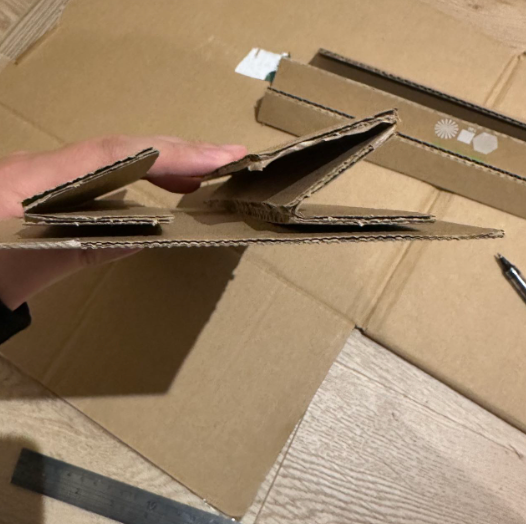
The initial 3D-printed prototypes were too thin and broke under minimal pressure, making them unsuitable for frequent tactile use. I reprinted the signs with increased thickness to improve their durability. Due to time constraints, I produced the wall paving prototype using cardboard as a quicker alternative for testing the concept.
User Testing
I conducted a second round of user testing with the new prototypes, which showed that the system effectively guided users without disrupting the wider environment. The feedback also highlighted opportunities to expand the system, with suggestions to introduce additional signs for common obstacles and features, such as bins, to provide more comprehensive navigation support.