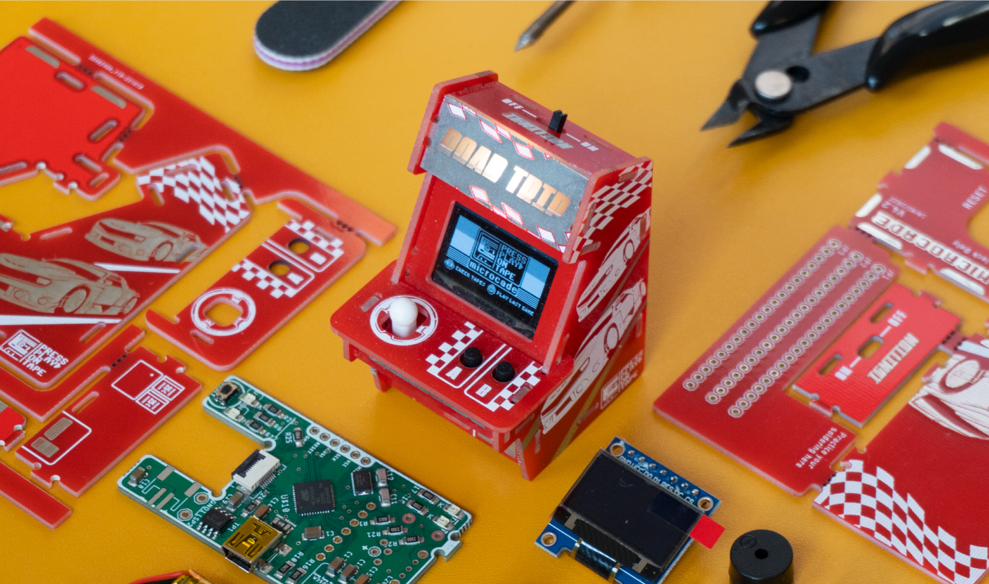
Microcade is a DIY mini arcade machine sold directly to consumers. I worked across the entire product experience, from customer research and brand identity to packaging, physical product design, web design, and launch.
Role Timeline
Co-Founder & 2023-2024
Creative Marketing Lead
Scope
Audience Research · Creative Strategy · Brand Identity · Art Direction · Campaigns · Social Content · Packaging · Web Design · Product Launch
Challenge
My challenge was to develop a company from the ground up with no previous entrepreneurial experience, designing the end-to-end product and brand experience. Rather than focusing on a single stage of the product journey, I had to consider the entire process, from concept and strategy through to design, production, and customer experience, requiring me to think creatively and holistically about the business as a whole.
Solution
My main scope included designing the website and packaging, as well as building relationships with artists for future collaborations. The concept centred around premium toy branding, using colour, variation and collectability to appeal to hobbyists with both the passion and disposable income to invest in the brand. With mentorship from the founder of my previous startup role, I made this happen!
PCB Art Design
Scroll to view
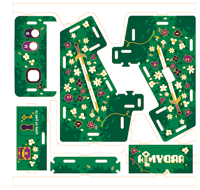
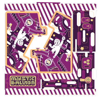
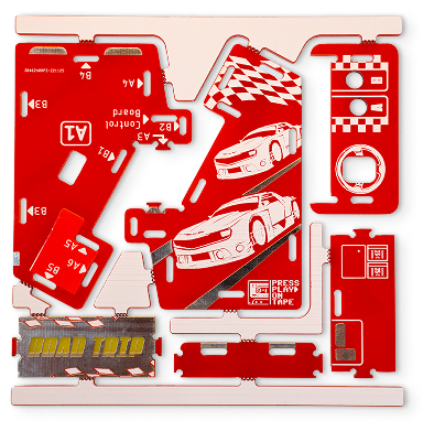
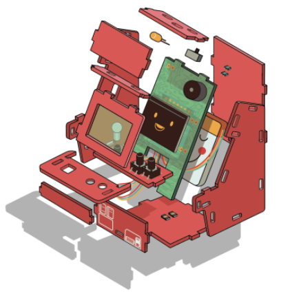
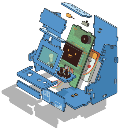
I led the design and onboarding of artists collaborating with the brand, creating an artist handbook with Printed Circuit Board (PCB) blueprints and guidelines for developing artwork using the boards. This led to new microcade variations to expand the collection and appeal to a wider range of collectors.
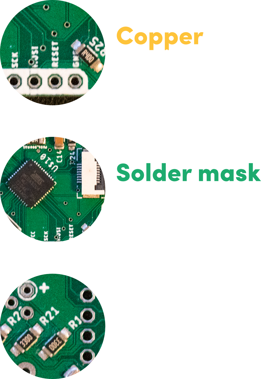
A key innovation was using the different layers of the PCB (including the silkscreen, copper, solder mask, and exposed copper) to create visual elements such as shadows, highlights, and outlines. This approach reduced material waste while creating a distinctive aesthetic that resonated with the client base and offered a novel way of combining electronics and art.
Packaging Design V1
The packaging needed to balance four key requirements: low production cost, secure protection of the contents, a compact footprint to reduce shipping and storage costs, and an engaging unboxing experience that extended the product’s sense of fun.
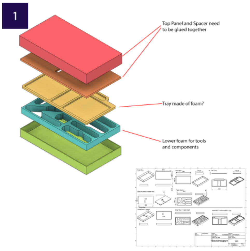
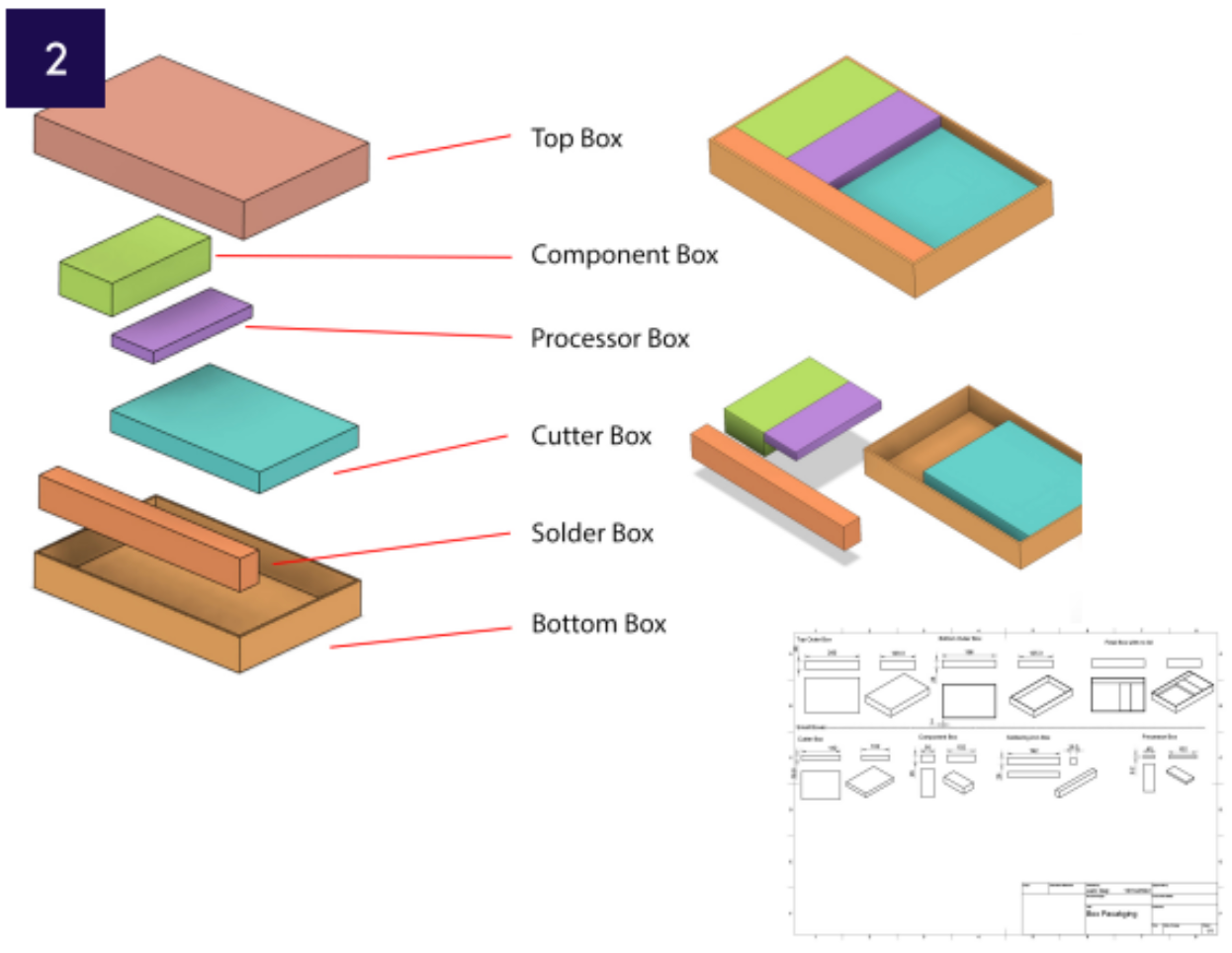
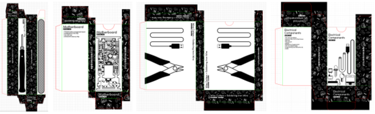
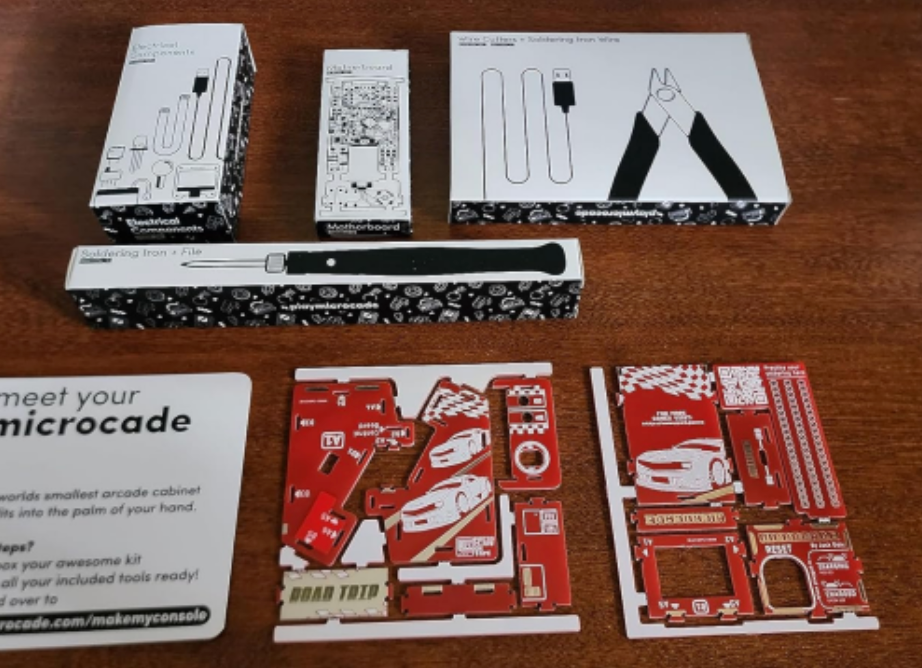
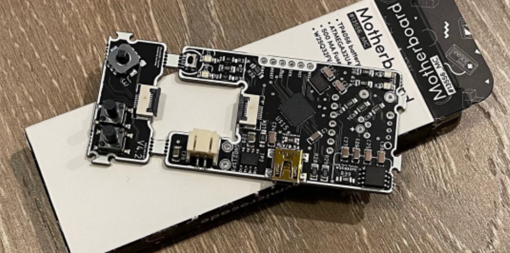
I developed two packaging concepts, refining each through feedback from manufacturers. The first used multiple foam inserts, either CNC-milled or die-cut, which provided a premium appearance and kept the components secure but proved too expensive to produce. The second replaced the foam with lightweight card boxes, reducing production and shipping costs while extending the unboxing experience. Components could also be grouped into individual boxes, making the packaging more organised and engaging.
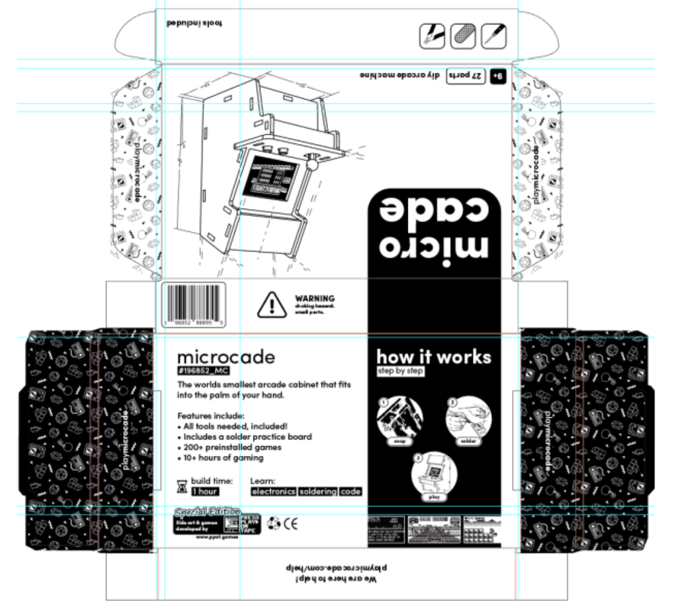
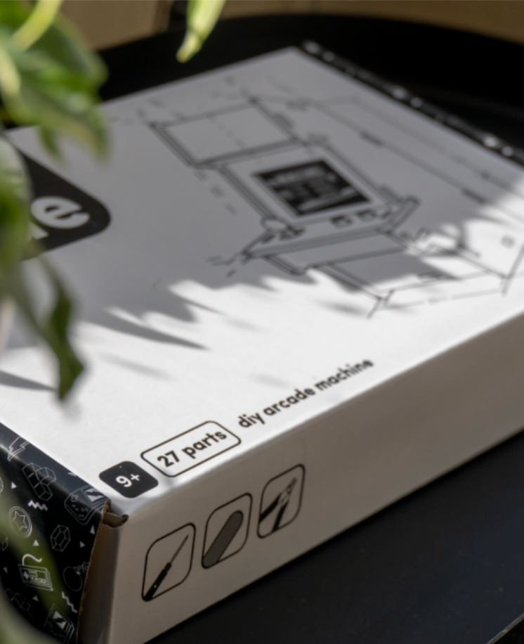
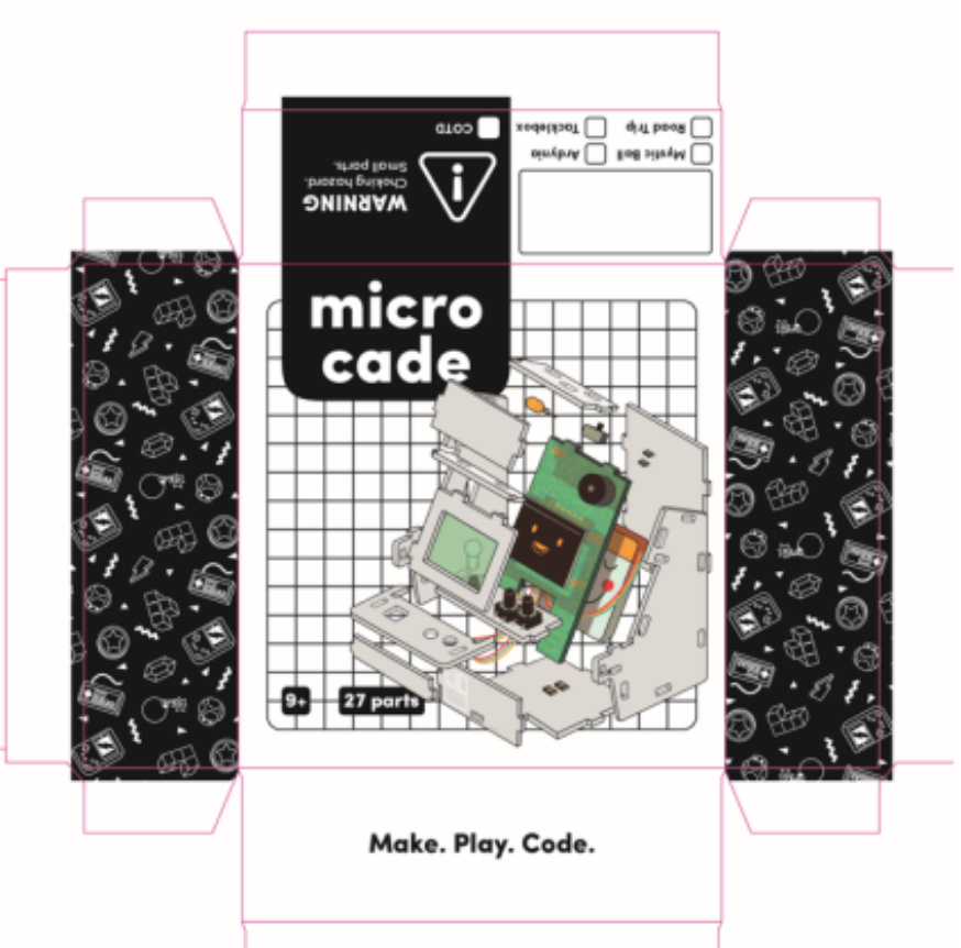
I used Adobe Illustrator to develop the packaging nets, vectorising each component to clearly show customers what was included in the box. I introduced icons to highlight that the kit contained all the tools needed for assembly, alongside a retro arcade pattern that became a key brand motif. The back of the packaging featured a complete overview of the components, allowing customers to check that everything was included. Finally, I designed a paper insert directing customers to the online assembly instructions, creating a clear transition from unboxing to building.
Packaging Design V2
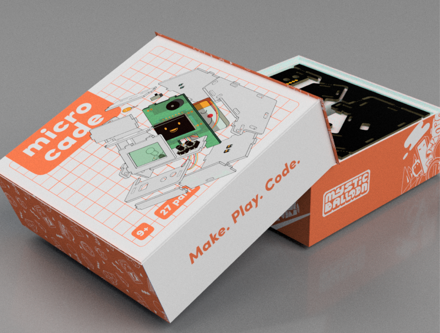
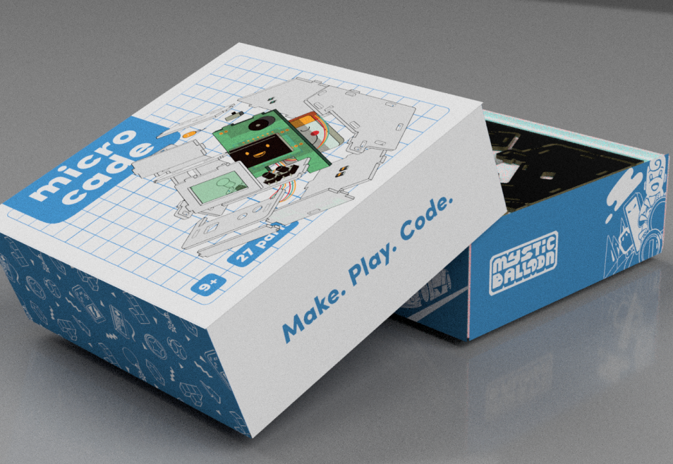
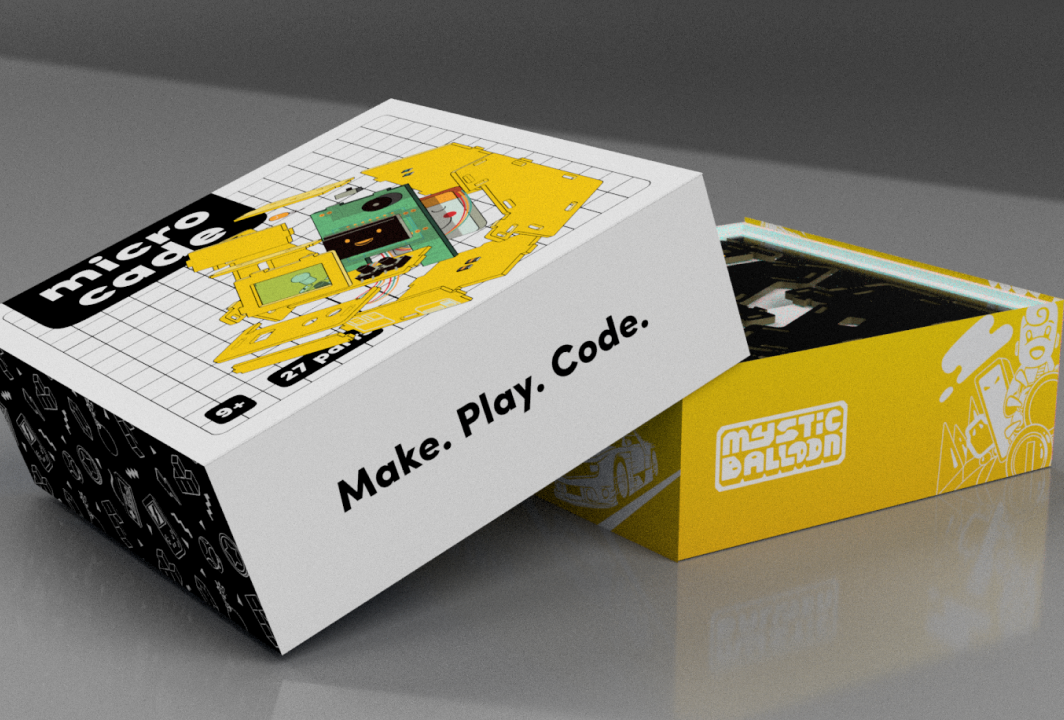
As the company grew, we introduced new product variations and began shifting towards a more premium customer experience. I redesigned the packaging to reflect the distinct identity of each product while maintaining a cohesive brand system. As the target audience evolved towards hobbyists who were more likely to already own the necessary tools, I also removed them from the packaging, allowing for a more streamlined and premium product experience.
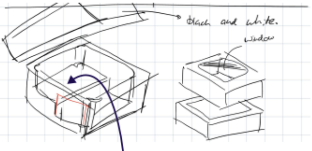
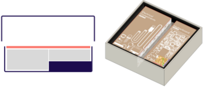
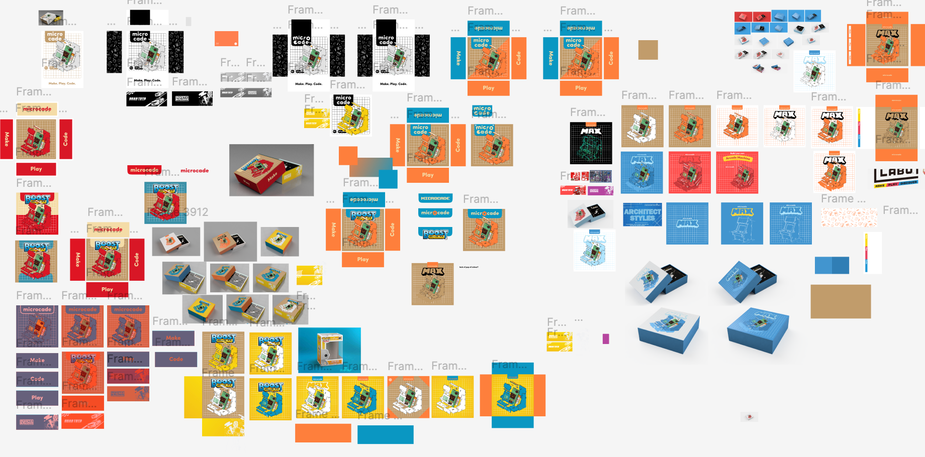
I introduced colour to make the packaging more engaging and appealing to the target audience, while upgrading to a higher-quality box to create a more premium experience. I also reduced the packaging footprint to improve shipping and storage efficiency, while reusing existing internal packaging to minimise upfront production costs.
To maintain the brand’s playful identity, I incorporated illustrations into the packaging, creating a visual connection between the physical packaging and the website. This helped establish a more cohesive brand experience across both digital and physical touchpoints.
Web Design
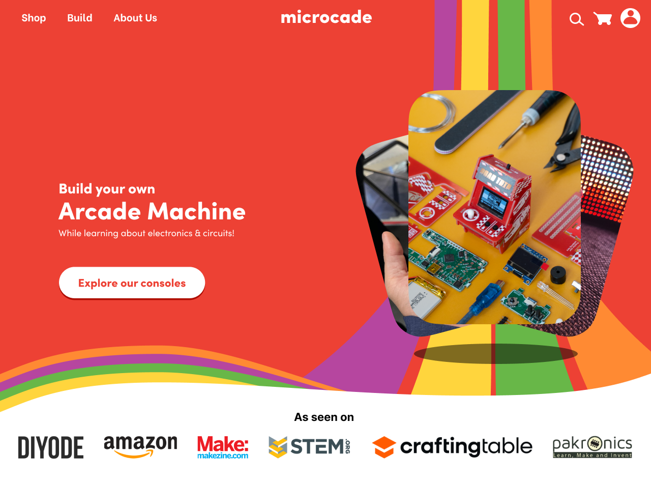
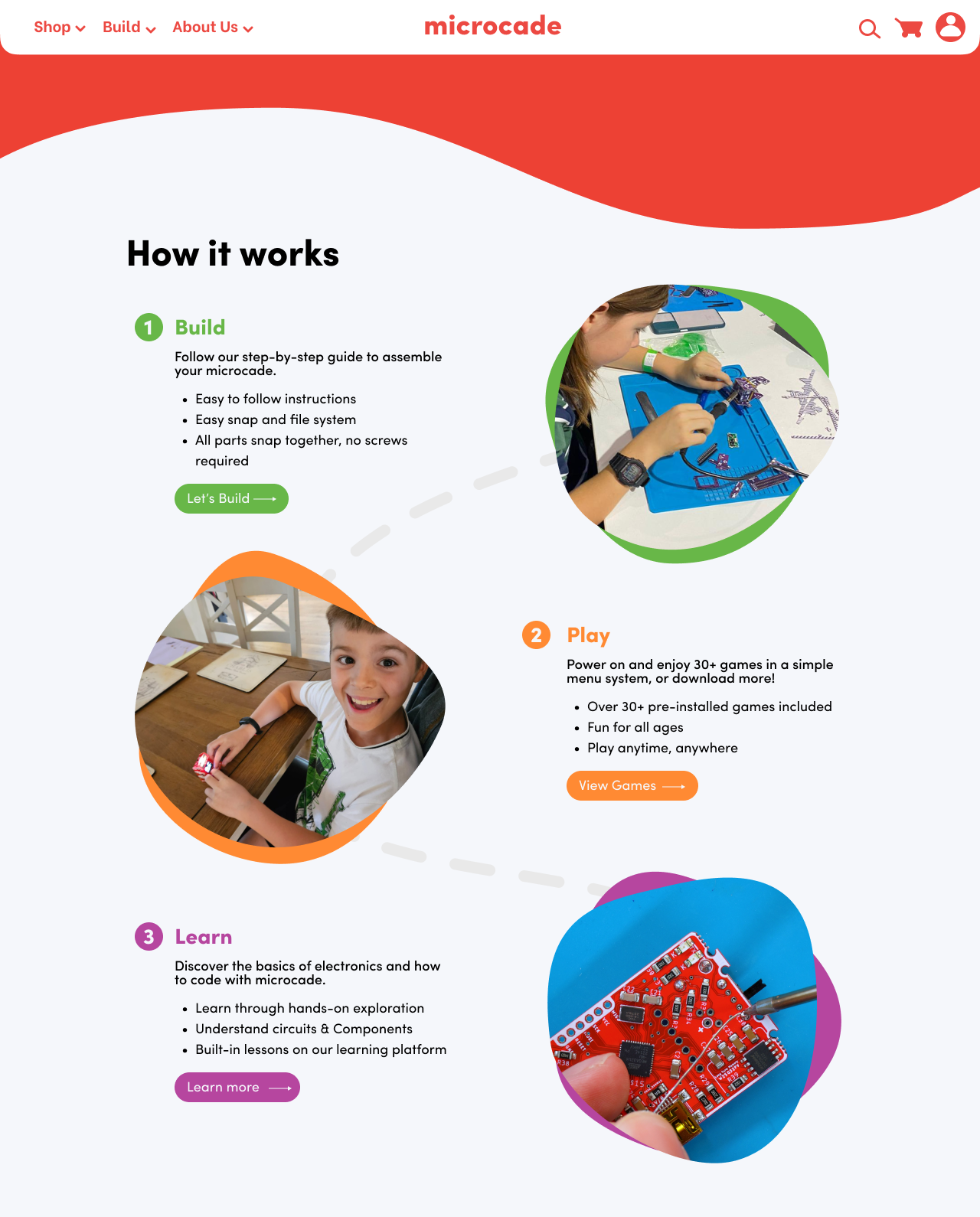
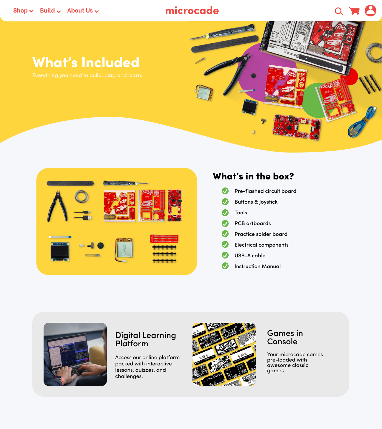
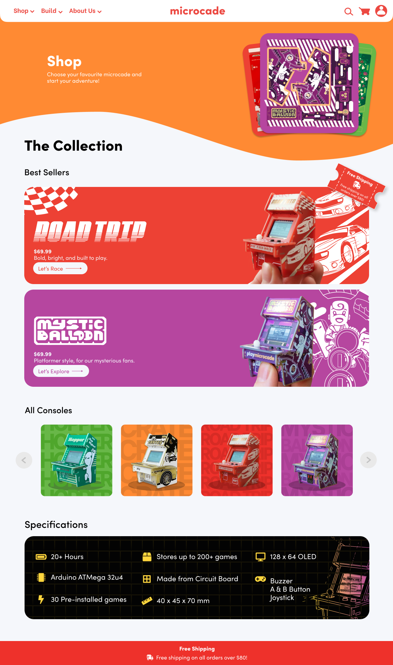
I designed the entire Microcade website in Figma before handing it over to developers for implementation. The goal was to provide customers with clear and useful product information while establishing a playful, colourful identity that reflected the brand’s character. I also ensured that parents and educators could easily understand the educational value of the products, balancing the appeal of a toy brand with its learning-focused purpose.
Outcome
2 International Schools Maker Faire Rome
Incorporated microcade into their Invited to showcase and run workshops,
Year 7 curriculum selling out within 2 days
My proudest achievement was shaping Microcade into a cohesive product and brand experience from the ground up. Through the development of its packaging, website, visual identity and artist collaborations, I helped transform the product from a DIY kit into a premium, collectible experience. The microcade went on to be stocked by distributors, receive a Best in STEM award, build a strong and engaged fanbase, and found its way into makerspaces and STEM events around the world. These outcomes demonstrated the versatility of Microcade as both a product and a learning tool, while validating the brand and design direction I helped establish.